Look and Feel Customization for iOS HAAPI Mobile Apps
On this page
The username password flows tutorial showed how the UI SDK receives Hypermedia Authentication API (HAAPI) responses and dynamically creates login screens using the API response data. The default look and feel was used, so that the app and its login screens initially looked different.
This tutorial shows how to implement styling and customization, so that login screens can be quickly branded to have the same look and feel as your app. For an automated setup that shows some of these techniques in action, you can check out the HAAPI iOS code example.
Application Theme
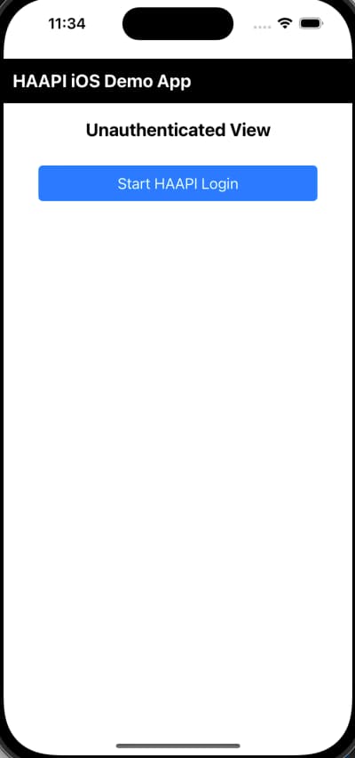
In the iOS integration tutorial, a minimal app was created with a simple theme, using the following look and feel:
Navigation Options
The integration tutorial used a modal window for the login screen. This starts HAAPI flow activity using a bottom to top transition animation, then closes it with an animation from top to bottom. Alternatively a PresentationMode.stack option can be used. See the HAAPI UI SDK documentation for further details.
Apply the HAAPI Theme
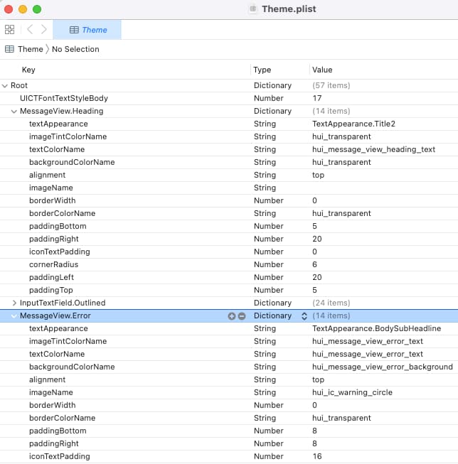
When the UI SDK framework is added to an Xcode project, it includes a Theme.plist file, with default settings for user interface elements. These default values are also provided in the developer docs:
To override the theme, add a property list resource to the project, then reference it when creating the HAAPI application class. You can then easily override properties from the default theme by providing the same key with a custom value.
self.haapiUIKitApplication = HaapiUIKitApplicationBuilder(haapiUIKitConfiguration: haapiUIKitConfiguration).setThemingPlistFileName("CustomTheme").build()
Customize Colors and Styles
The SDK colors are represented by fixed keys such as hui_button_background_primary and hui_button_text. To override a color, you can create your own colorset resource whose names match an SDK key, then assign your preferred colors.
A more general approach for customization is to style a resource in the custom theme file, based on the UI element type. In the following example, the main buttons used in login flows are updated to use a custom background color. In addition, the finer details of text are configured in a separate TextAppearance object:
<?xml version="1.0" encoding="UTF-8"?><!DOCTYPE plist PUBLIC "-//Apple//DTD PLIST 1.0//EN" "http://www.apple.com/DTDs/PropertyList-1.0.dtd"><plist version="1.0"><dict><key>ActionableButton.Primary</key><dict><key>backgroundColorName</key><string>Color.blue</string><key>minHeight</key><integer>48</integer><key>textAppearance</key><string>TextAppearance.Body.Bold</string></dict><key>TextAppearance.Body.Bold</key><dict><key>fontStyleName</key><string>UICTFontTextStyleBody</string><key>fontSymbolicTrait</key><string>traitBold</string><key>textAlignment</key><string>natural</string></dict></dict></plist>
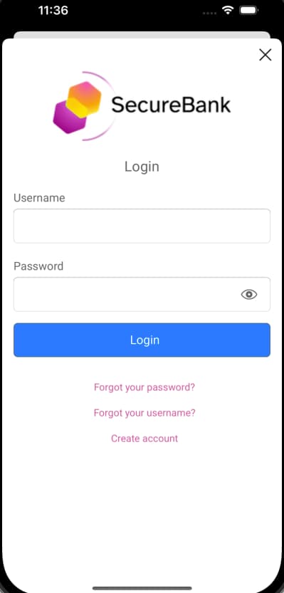
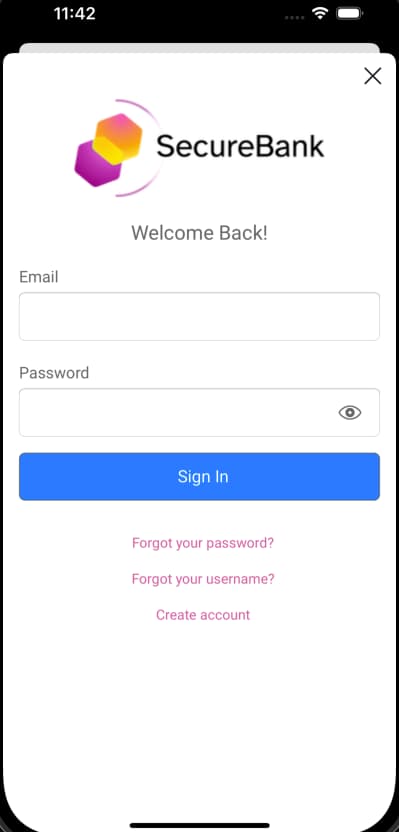
Add a Custom Logo
To provide a custom logo, first ensure that an imageset resource is added to the application's assets catalog. Then include a HeadrView.imageName property in the custom theme, with the same name as the imageset.
<?xml version="1.0" encoding="UTF-8"?><!DOCTYPE plist PUBLIC "-//Apple//DTD PLIST 1.0//EN" "http://www.apple.com/DTDs/PropertyList-1.0.dtd"><plist version="1.0"><dict><key>HeaderView</key><dict><key>imageName</key><string>example_logo</string></dict></dict></plist>
The following screenshot shows the updated appearance:
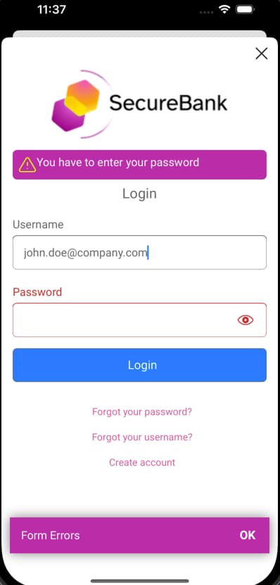
Customize Output Formats
To change the appearance of text displayed, you again work with styles. Adding the following styles to the theme customizes the appearance of info messages shown in result screens, and error messages shown when a failure needs to be presented:
<?xml version="1.0" encoding="UTF-8"?><!DOCTYPE plist PUBLIC "-//Apple//DTD PLIST 1.0//EN" "http://www.apple.com/DTDs/PropertyList-1.0.dtd"><plist version="1.0"><dict><key>MessageView.Error</key><dict><key>backgroundColorName</key><string>purple</string><key>textColorName</key><string>primarytext</string><key>imageName</key><string>hui_ic_warning</string><key>imageTintColorName</key><string>lightyellow</string></dict><key>MessageView.Info</key><dict><key>backgroundColorName</key><string>primary</string><key>textColorName</key><string>primarytext</string></dict><key>NotificationBannerView</key><dict><key>backgroundColorName</key><string>purple</string></dict></dict></plist>
This example would result in the following updated appearance:
Customize Text Values
Fixed text values, such as labels, are provided by the hypermedia API endpoint, in the response messages. To change these values, use message files. As an example, you can define a file as follows to override values in the username and password login screen:
meta.title=Welcome Back!page.title=Welcome Back!view.top-header=Welcome Back!view.authenticate=Sign Inview.username=Emailview.password=Passwordview.no-account=Create accountview.forgot-password=Forgot your password?view.forgot-account-id=Forgot your username?view.success=You have been successfully authenticatedvalidation.error.authentication.failed=Something went wrong while authenticating your account. Please try again.validation.error.incorrect.credentials=Incorrect credentialsvalidation.error.accountId.required=You have to enter your usernamevalidation.error.password.required=You have to enter your password
This file must then be deployed to the following location, to override values for the Curity Identity Server:
$IDSVR_HOME/usr/share/messages/overrides/en/authenticator/html-form/authenticate/messages
It results in the following customized display:
Customize Browser Flows
The tutorial on password flows showed that some operations, such as password reset, are rendered in the browser rather than by the UI SDK. For information on customizing the look and feel for browser screens, and also on managing overrides and template areas, see the following resources:
SDK Documentation
This tutorial provides a summary of the styling and customization techniques. You can find further details on more advanced customizations in the HAAPI SDK Docs and the iOS UI SDK Reference Docs.
Conclusion
This tutorial has summarized the approach for enhancing the default look and feel for login screens, to match your brand. This involves only simple declarative updates, to set styles and colors. Once these techniques are understood, they can also be applied to advanced authentication flows.
Customer Stories
Learn how organizations run identity and API security at scale.
Read customer storiesWas this helpful?