Extended Look and Feel Customization with UI Kit
On this page
The Curity Identity Server comes with a powerful system for customizing the look and feel of user facing screens. These can be tailor-made according to your needs. When getting started you can make fast edits in the Admin UI, as explained in Customize the Look and Feel. This tutorial explains how to manage more advanced use cases, such as different branding per OAuth client.
For example, if your organization has several brands, the user can be presented with a specific brand depending on which application they are using. The templating system enables an overlay possibility of existing templates with your choice of colors, logos and fonts. Making it possible to completely style the look and feel. This tutorial explains the main concepts.
UI Kit
The UI Kit is a GitHub repository that enables you to customize the look and feel of your applications. It's a monorepo containing Curity Identity Server templates, Self Service Portal, Login Web App, Curity CSS, Curity UI Icons React and a Component Library for React.
To run the UI Kit locally, clone or fork the repository. You will need Node.js, use nvm use to switch to the correct version.
Once you have met the prerequisites, run these commands:
npm installnpm start- A browser tab will be opened automatically with an overview page. Follow the links to open the Identity Server template listing page and Self Service Portal previewer.
Template System
All screens that are presented to the user are based on templates. The Curity Identity Server uses the Velocity templating language to allow for reusability between screens. The templates use a pre-defined hierarchy that can be reused if desired. However the system allows for freedom to customize everything with your own template hierarchy.
├── core├── overrides│ └── fragments│ └── logo.vm (overridden template)└── template-areas├── brand-1│ └── settings.vm (custom settings, css theme etc)└── brand-2└── settings.vm (custom settings, css theme etc)
Variables
Some screens are controlled by Velocity variables. For example to set a custom logo, you can set your own logo in the settings.vm file. Read more about Velocity templates in Using UI Kit.
#set ($logo_path = "/images/company-logo.svg")
Overriding Templates
If you want to create a template that will override an existing core template, create a copy in the overrides directory following the same structure as the core templates. As a simple example, to override the fragments/logo.vm, copy it to overrides/logo.vm and make your changes.
Template Areas
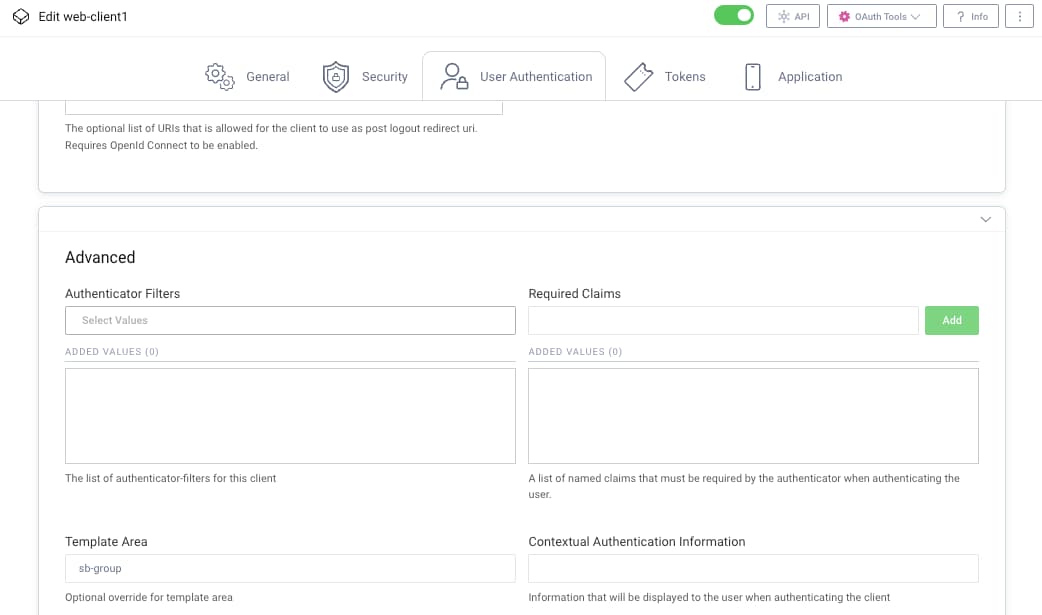
Just like overrides, all the variables and templates can be overridden. But with template areas you can customize branding for different OAuth clients. Read more about overrides and template areas in Using UI Kit
The following Admin UI screenshot shows how a template area is assigned to an OAuth client. It is also possible to configure a template area against an authenticator or authentication action, to restrict the clients that can use it.
UI Design
You can incorporate your own UI Design using any CSS, including Layout, typography, colors, styling, animation and transitions, responsive design, accessibility. The custom theming system gives you complete freedom.
Creating a Theme
Themes are handled in the workspace package Curity CSS library. First make a copy of the the default curity-theme.css to my-company-brand.css.
Changing Theme Variables
Themes are built with CSS Custom Properties (sometimes referred to as CSS variables or cascading variables). Theme files contains only a list of properties, using the custom property notation (key/value). --color-spot: #d859a1; and are accessed using the var() function (e.g., color: var(--main-color);). Since themes are created with CSS Custom Properties, this also means that the variables can be easily modified with JavaScript and also created outside the UI Kit, all you need is a text editor.
Curity themes follow a common best practice that is to define custom properties on the :root pseudo-class, so that it can be applied globally across your HTML document. Some examples of avaliable variables are shown here:
:root {--color-text: #737373;--color-primary: #323c53;--color-info: #62818f;--color-danger: #ca2e2b;--color-warning: #e0c01c;--color-spot: #d859a1;...}
A theme consists of different sets of variables to style different components in the application. To view a complete list of all the theme variables, see the docs on Customizing Branding per Application
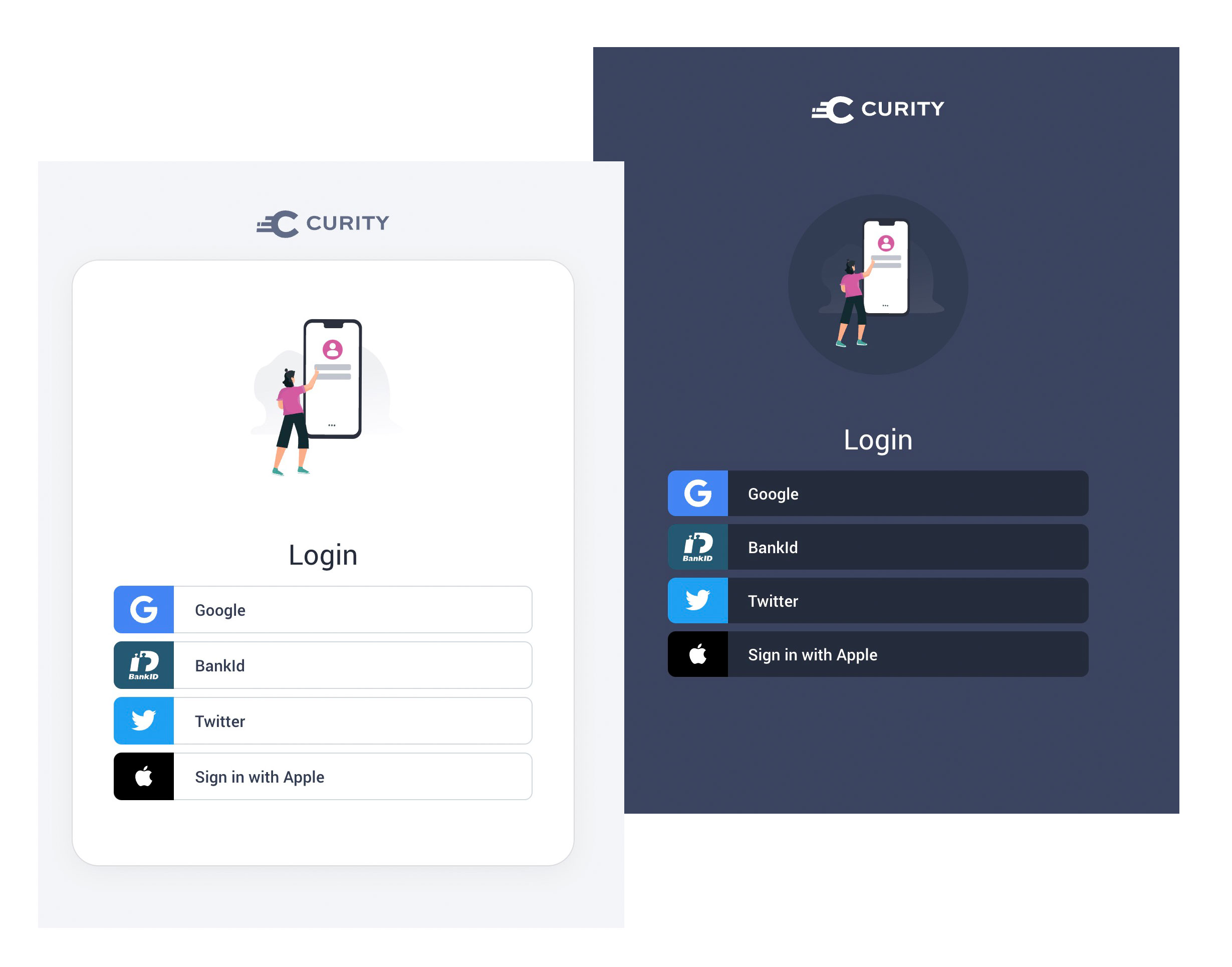
Dark and Light Colors
A basic set of light and dark theme options come shipped by default. By changing these to variables in template-areas/my-company-brand/settings.vm you can quickly switch between a light and dark skin.
#*Background color.body-light = White background colorbody-dark = Dark background color*##set ($body_background = 'body-light')#*Login form background colorform-light = White background around formform-transparent = Transparent around form*##set ($login_form_background = 'form-light')
Custom CSS
Depending on if you are using the built in light or dark theme settings you can scope your styles with these corresponding body classes:
.body-light {// For when the standard light mode is used (default)// #set ($body_background = 'body-light')}.body-dark {// When the dark mode is used// #set ($body_background = 'body-dark')}.body-dark {// When the dark mode and a transparent well is used, making form fields appear empty against the background color.// #set ($login_form_background = 'form-transparent')// #set ($body_background = 'body-dark')}.body-dark .form-transparent {// You can further customize the modes within the form well, if you want to make form fields appear empty against the background color.// #set ($login_form_background = 'form-transparent')// #set ($body_background = 'body-dark')}
Create a Template Area
To create a template area, start by creating template-areas/my-company-brand/settings.vm. This file contains the settings for a custom logo, and can point to a custom css theme.
#set ($logo_path = "/images/hm-logo.svg")#set ($theme_css_path = $!_staticResourceRootPath + '/css/my-company-brand.css')#set ($main_css_path = $!_staticResourceRootPath + '/css/main.css')
Main CSS Path
The main_css_path must be included, since it contains the base css boilerplate, icons, and normalizations.
Now you can preview your template area by appending ?area=my-company-brand to the URL.
http://localhost:3000/authenticator/html-form/authenticate/get?area=my-company-brand`
After deployment, to activate the theme in the Curity Identity Server, configure my-company-brand as the template area for one or more OAuth clients.
CSP and External Fonts
If you want to use hosted web fonts via for example Google Fonts, Typekit or similar services you need to extend this using Content Security Policy (CSP). CSP is an added layer of security that helps to detect and mitigate certain types of attacks, including Cross Site Scripting (XSS) and data injection attacks.
Copy src/curity/templates/core/fragments/csp.vm to our template area in src/curity/templates/template-areas/my-company-brand/fragments/csp.vm For example, to allow Google Web Fonts, change the CSS settings to include its domain:
#set ($styleSrc = "style-src 'self' https://fonts.googleapis.com 'unsafe-inline' ${nonceScriptSrc};")
This will result in HTML being downloaded that includes the additional domain in its CSP:
<meta http-equiv="Content-Security-Policy" content="connect-src 'self'; font-src 'self' https://fonts.gstatic.com; $childSrc">
In the custom theme at src/curity/scss/my-company-theme.scss you can then import and use custom fonts:
@import url('https://fonts.googleapis.com/css?family=Calistoga&display=swap');body {font-family: 'Calistoga', serif;}
Conclusion
This tutorial explained the tools and techniques available to frontend developers, when customizing the login look and feel for the Curity Identity Server. This enables complete control over the look and feel, including distinct brands per client application when needed. See also the Customization Examples, which includes a GitHub repository with some real customizations that you can use as a starting point.
Customer Stories
Learn how organizations run identity and API security at scale.
Read customer storiesWas this helpful?