
Customizing the Android HAAPI Mobile Login User Experience
On this page
The username password flows tutorial showed how the UI SDK receives Hypermedia Authentication API (HAAPI) responses and dynamically creates login screens using the API response data. The default look and feel was used, so that the app and its login screens initially looked different.
This tutorial shows how to implement styling and customization, so that login screens can be quickly branded to have the same look and feel as your app. For an automated setup that shows some of these techniques in action, you can check out the HAAPI Android code example.
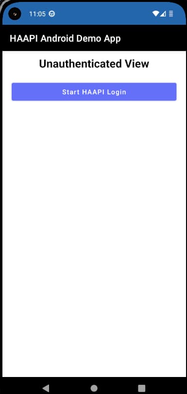
Application Theme
In the Android integration tutorial, a minimal app was created with a simple theme, using the following look and feel:
Navigation Options
The integration tutorial used a modal window for the login screen. This starts HAAPI flow activity using a bottom to top transition animation, then closes it with an animation from top to bottom. Other options for PresentationMode.STACK and PresentationMode.CUSTOM are possible if you want to customize navigation behavior further. See the HAAPI UI SDK documentation for further details.
Apply the HAAPI Theme
First ensure that you apply either the @style/Theme.Haapi.Ui.Widget.BaseTheme or the Activity.Modal theme to the HAAPI flow activity, in your app/src/main/AndroidManifest.xml.xml file:
<activityandroid:name="se.curity.identityserver.haapi.android.ui.widget.HaapiFlowActivity"android:label="Haapi Flow"android:theme="@style/Theme.Haapi.Ui.Widget.BaseTheme"/>
Alternatively you can create a derived theme in your app/src/main/res/values/styles.xml file and reference that in the manifest. Then use the go to definition features of Android Studio to view the base styles that you can override. Hypermedia UI elements use the hui prefix, and you can override styles by adding them to the new custom theme:
<style name="Theme.DemoApp.Haapi.Custom" parent="@style/Theme.Haapi.Ui.Widget.Activity.Modal"><item name="huiButtonPrimaryStyle">@style/Haapi.Button.Custom</item><item name="huiHeaderViewStyle">@style/Haapi.HeaderView.Custom</item><item name="huiLinkViewStyle">@style/Haapi.LinkView.Custom</item><item name="huiInfoViewStyle">@style/Haapi.InfoView.Custom</item><item name="huiInputTextViewStyle">@style/Haapi.InputTextView.Custom</item><item name="huiMessageViewStyle">@style/Haapi.MessageView.Custom</item></style>
Customize Colors and Styles
To change colors, the simplest option is to just override the HAAPI values in your own colors.xml file. These values update the colors of buttons and output text to match the app's own colors:
<color name="hui_button_background_primary">@color/blue</color><color name="hui_button_background_secondary">@color/white</color><color name="hui_button_text">@color/white</color><color name="hui_message_view_info_text">@color/blue_dark</color><color name="hui_message_view_error_text">@color/white</color><color name="hui_error_immutable">@color/purple</color>
To customize a style, find the component's stylable definition. It is possible to override this completely, by specifying an empty parent, then providing all attributes:
<style name="Haapi.Android.Ui.Widget.Button.Primary" parent=""><item name="huiButtonBackground">@drawable/hui_button_primary_shape</item><item name="huiButtonTextAppearance">@style/TextAppearance.Haapi.Android.Ui.Widget.Button.Primary</item><item name="huiButtonLoadingIndicatorStyle">@style/Haapi.Android.UI.Widget.Button.LoadingIndicator.Primary</item></style>
More commonly, you will use inheritance to override particular attributes, rather than replacing an entire style. The following example customizes the way text is rendered on buttons:
<style name="Haapi.Custom.Button.Primary" parent="@style/Haapi.Android.Ui.Widget.Button.Primary"><item name="huiButtonTextAppearance">@style/Haapi.Custom.Button.Primary.TextAppearance</item></style><style name="Haapi.Custom.Button.Primary.TextAppearance" parent=""><item name="android:textStyle">bold</item><item name="android:textSize">20sp</item></style>
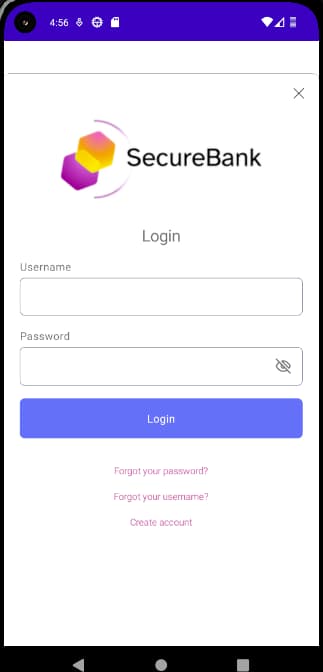
Add a Custom Logo
To provide a custom logo, override the huiHeaderViewStyle and provide a custom image in the drawable. If required you can use an empty android:src value to remove the logo completely:
<style name="Haapi.Android.Ui.Widget.HeaderView" parent=""><item name="android:src">@drawable/securebank_logo</item></style>
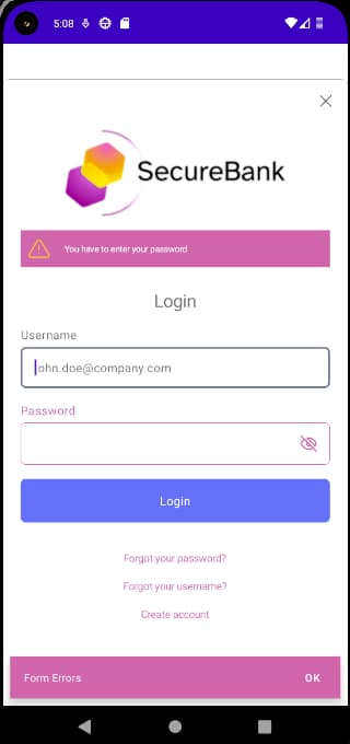
Customize Output Formats
To change the appearance of text displayed, you again work with styles. Adding the following styles to the theme customizes the appearance of info messages shown in result screens, or error messages when a failure needs to be presented.
<style name="Theme.DemoApp.Haapi.Custom" parent="@style/Theme.Haapi.Ui.Widget.BaseTheme"><item name="huiMessageViewInfoStyle">@style/Haapi.Custom.MessageView.Info</item><item name="huiMessageViewErrorStyle">@style/Haapi.Custom.MessageView.Error</item></style><style name="Haapi.Custom.MessageView.Info" parent="@style/Haapi.Android.Ui.Widget.MessageView.Info"><item name="huiMessageViewBackground">@color/white</item><item name="huiMessageViewIconTint">@android:color/holo_orange_light</item></style><style name="Haapi.Custom.MessageView.Error" parent="Haapi.Android.Ui.Widget.MessageView.Error"><item name="huiMessageViewBackground">@color/purple</item><item name="huiMessageViewIconTint">@android:color/holo_orange_light</item></style>
This example would result in the following updated appearance:
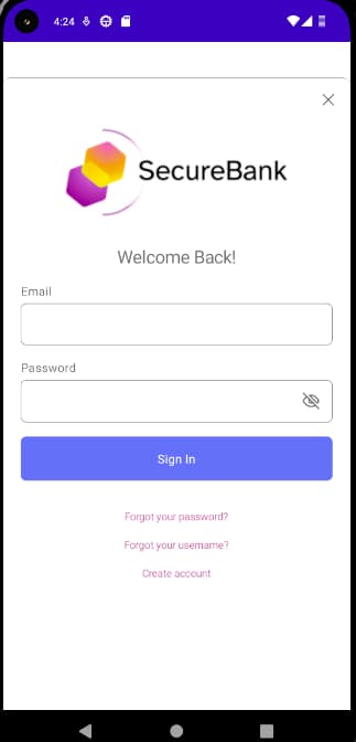
Customize Text Values
Fixed text values, such as labels, are provided by the hypermedia API endpoint, in the response messages. To change these values, use message files. As an example, you can define a file as follows to override values in the username and password login screen:
meta.title=Welcome Back!page.title=Welcome Back!view.top-header=Welcome Back!view.authenticate=Sign Inview.username=Emailview.password=Passwordview.no-account=Create accountview.forgot-password=Forgot your password?view.forgot-account-id=Forgot your username?view.success=You have been successfully authenticatedvalidation.error.authentication.failed=Something went wrong while authenticating your account. Please try again.validation.error.incorrect.credentials=Incorrect credentialsvalidation.error.accountId.required=You have to enter your usernamevalidation.error.password.required=You have to enter your password
This file must then be deployed to the following location, to override values for the Curity Identity Server:
$IDSVR_HOME/usr/share/messages/overrides/en/authenticator/html-form/authenticate/messages
It results in the following customized display:
Customize Browser Flows
The tutorial on password flows showed that some operations, such as password reset, are rendered in the browser rather than by the UI SDK. For information on customizing the look and feel for browser screens, and also on managing overrides and template areas, see the following resources:
- Fast Look and Feel Customization with the Admin UI
- Extended Look and Feel Customization with the UI Builder
SDK Documentation
This tutorial has provided only brief details, to introduce you to the styling and customization techniques. Once the concepts are understood, they can be applied to any UI element shown during HAAPI flows. Further technical information is available in the HAAPI SDK Developer Docs.
Conclusion
This tutorial has summarized the approach for enhancing the default look and feel for login screens, to match your brand. This involves only simple declarative updates, to set styles and colors. Once these techniques are understood, they can also be applied to advanced authentication flows.
Join our Newsletter
Get the latest on identity management, API Security and authentication straight to your inbox.
Start Free Trial
Try the Curity Identity Server for Free. Get up and running in 10 minutes.
Start Free Trial


