---
title: "Extended Look and Feel Customization with UI Kit"
description: "Learn the building blocks to take full control over the look and feel of Curity Identity Server login forms"
url: "https://curity.io/resources/learn/customize-look-and-feel/"
date: "2026-07-29"
area: "tutorials"
topic: "howtos"
pagegroup: "branding-user-experience"
repository: "https://github.com/curityio/ui-kit"
---
# Extended Look and Feel Customization with UI Kit
The Curity Identity Server comes with a powerful system for customizing the look and feel of customer-facing login forms, to provide your preferred user experiences. When getting started you can make fast edits in the Admin UI, to [Customize the Look and Feel](https://curity.io/resources/learn/customize-look-and-feel-simple/).
If your organization has several brands, users can interact with branded logins screens for distinct OAuth or SAML clients. The templating system enables you to customize and deploy HTML, JavaScript, CSS and localized text. You can configure the finer details of your referred colors, logos and fonts.
This tutorial explains how to get up and running with the UI Kit, so that you understand the concepts and the technical setup. You can take complete control over the look and feel, develop with fast feedback, and then deploy your customizations.
## UI Kit
The UI Kit is a GitHub repository that enables you to quickly customize the look and feel of login forms used by applications. It's a monorepo containing previewers for customer-facing screens, Curity CSS, Curity UI Icons React and a Component Library for React.
To run the UI Kit locally, first clone the GitHub repository using the link at the top of this page. Then, run the following commands from the `ui-kit` folder. For best version compatibility, you may also need to run a command like `git checkout version/11.3` to use the branch that matches your product version, or use `git checkout dev` to get the latest stable development features.
```bash
nvm install
npm install
npm start
```
The `nvm install` command reads the repository's `.nvmrc` file, then installs and activates the Node version the UI Kit expects. In later terminal sessions, `nvm use` is enough to switch to that version, since it is already installed. If you do not use nvm, check `.nvmrc` and make sure your Node version matches.
The `npm start` command presents a previewer home page for all customer-facing web frontends, with `Open previewer` buttons. The following diagram shows the overall structure of the UI Kit repository.

You can use one of the `Open previewer` buttons to productively implement most frontend customizations, without the need to run the Curity Identity Server and OAuth flows. You make edits to HTML, CSS and JavaScript resources in a text editor, like Visual Studio Code, and then see fast feedback in the browser.
**Identity Server Templates**
By default, when OAuth or SAML clients initiate user logins, the Curity Identity Server downloads HTML forms to the browser. To do so, it processes [Velocity Templates](https://velocity.apache.org/engine/1.7/user-guide.html). Each template is a `.vm` file that contains HTML elements, server-side logic and can also contain client-side logic. Each `.vm` file has a path that you can browse to in the previewer application.

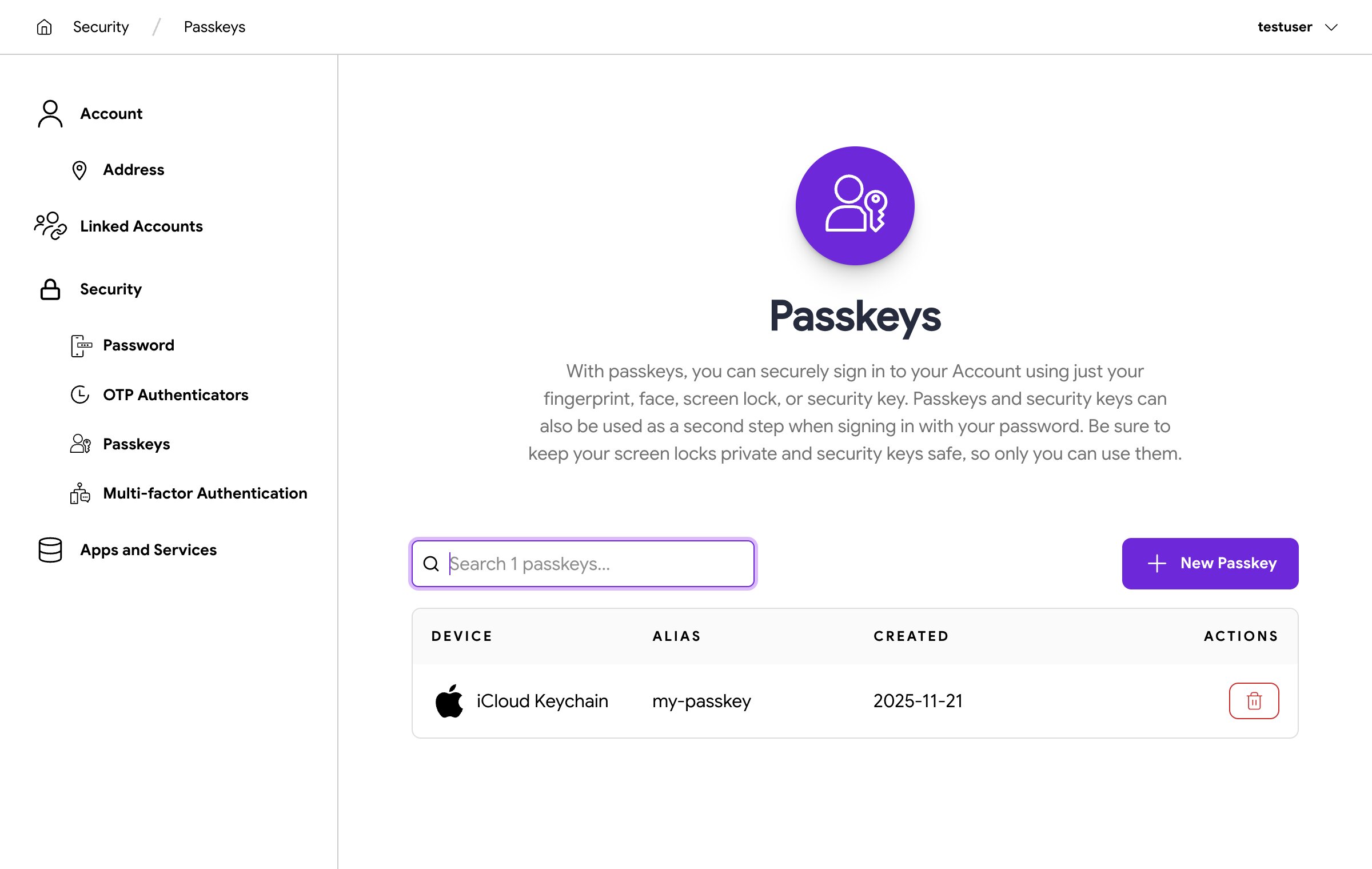
**User Self-Service Portal**
The [User Self-Service Portal](https://curity.io/resources/learn/user-self-service-portal/) is a single page application (SPA) that enables users to manage their user account settings, authentication methods and API consents. Each view uses a distinct SPA path.
**HAAPI React App**
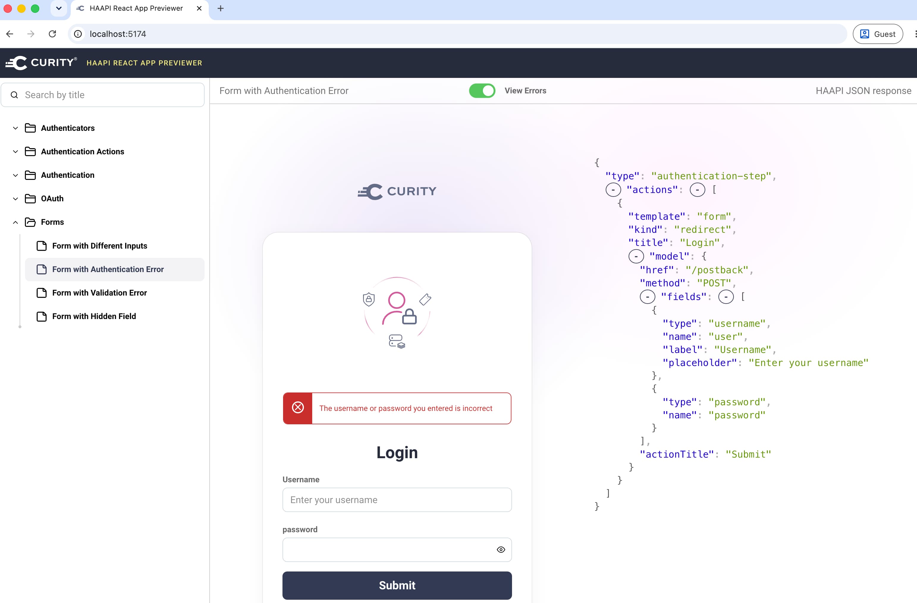
OAuth clients can use the [HAAPI React App](https://curity.io/resources/learn/haapi-react-app/) to run API-driven flows, in which case login forms run as a single page application (SPA). The HAAPI React App renders each login form from a JSON representation and enables web developers to build login experiences with familiar web technologies.
## The Templating System
Whichever area you want to customize, you should learn how the templating system enables delivery of customizations. The [Front-End Development](https://curity.io/docs/identity-server/developer-guide/front-end-development/) guide explains the templating system in depth, including details like server variables, view composition and deployment locations.
You should first understand the folder hierarchy under `$IDSVR_HOME/usr/share/templates`, where overrides enable you to apply custom branded logic to all clients. Template areas are similar, except that they only apply to a subset of clients.
```text
├── core
├── overrides
└──
└── template-areas
├── brand-1
│ └──
└── brand-2
└──
```
Never edit files in the `core` folder, since upgrades of the Curity Identity Server overwrite core files. Instead, copy resources to the `overrides` or `template-areas` folders and make edits to the copy.
For example, to make global customizations to the login form for the [HTML Forms Authenticator](https://curity.io/docs/identity-server/profiles/authentication-profile/authenticators/html/), copy its `.vm` file to an `overrides` folder with the following commands. Edit the copy and see changes in the previewer at `http://localhost:3000/authenticator/html-form/authenticate/get`.
```bash
cd src/identity-server/templates
mkdir -p overrides/authenticator/html-form/authenticate
cp core/authenticator/html-form/authenticate/get.vm overrides/authenticator/html-form/authenticate/
```
Similarly, to make a template area customization to the same screen, use the following commands to copy the `.vm` file to a `template-areas` folder . Edit the copy and see changes in the previewer at `http://localhost:3000/authenticator/html-form/authenticate/get?area=brand-1`.
```bash
cd src/identity-server/templates
mkdir -p template-areas/brand-1/authenticator/html-form/authenticate
cp core/authenticator/html-form/authenticate/get.vm template-areas/brand-1/authenticator/html-form/authenticate/
```
## Template Areas
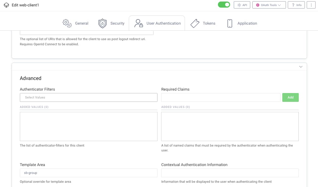
When you create a template area and deploy its resources, you can apply distinct branding for different OAuth or SAML clients. To assign a template area to an OAuth client, run the Admin UI and navigate to **Token Service** → **Clients**. Edit the client and select the **User Authentication** tab. Assign the template area and commit changes. The following screenshot shows a client associated to a template area.
Alternatively, assign a template area to any form-based authenticator or authentication action. To do so, navigate to **Profiles** → **Authentication Service** and edit the instance. Select the `More` tab for authenticators or the `Advanced` tab for authentication actions, to assign the template area. Commit changes to activate the theme for all clients that use the authenticator or authentication action.
## Development Assets
When working with the UI Kit, first locate entry points for each application. During development, you use local entry points, make edits and see fast feedback in the browser.
**Identity Server Templates**
Within the `src/identity-server` project, each HTML login form uses a `.vm` file to express its HTML structure. Templates use server-side variables to manage behaviors like preserving form data on postbacks, and `#message` directives to reference text. You can add JavaScript event handlers if you want to customize client-side logic.
```html
#if($_postBack && $_postBack.userName)
#set($userNameValue = $_postBack.userName)
#elseif($_username)
#set($userNameValue = $_username)
#end
```
JavaScript Validation
If you want to implement custom client-side validation logic in HTML login forms, prefer the use of validation procedures. The [Customize Password Validation](https://curity.io/resources/learn/customize-password-validation/) tutorial provides a custom validation example.
**User Self-Service Portal**
Within the `src/self-service-portal` project, the User Self Service Portal runs as a React single page application. The previewer uses the `npm start` command and a `previewer.html` entry point. The app itself uses the `npm run dev` command and an `index.html` entry point. The following abridged `index.html` shows that the bundler references an entry point, which triggers JavaScript and CSS downloads.
```html
Self Service Portal - Development Mode
```
Since the User Self-Service Portal is an SPA, it uses JavaScript to create HTML elements. You can change TypeScript code to add or change HTML elements, or to customize the frontend logic.
**HAAPI React App**
Within the `src/haapi-react-app` project, you run the HAAPI React App as a single page application. The previewer uses the `npm start` command and the `previewer/index.html` entry point. The app itself uses the `npm run dev` command and the `index.html` entry point. The following abridged `index.html` shows that the bundler references an entry point, which triggers JavaScript and CSS downloads.
```html
HAAPI React App - Development Mode
```
Since the HAAPI React App is an SPA, it uses JavaScript to create HTML elements. You can change TypeScript code to add or change HTML elements, or to customize the frontend logic.
## Text and Localization
When you deploy an instance of the Curity Identity Server, rendered text originates from message files. The [Localizing Resources](https://curity.io/docs/identity-server/developer-guide/front-end-development/localization/) guide provides further details on how to manage message keys and values, and how the Curity Identity Server selects a particular language. You can change existing text values or add your own message file entries, to guide users through login experiences in your preferred ways.
**Identity Server Templates**
To customize text values, first make a copy of the core message file. The following example commands create an override for the English `message` file for the HTML Forms Authenticator login form.
```bash
cd src/identity-server/messages
mkdir -p overrides/en/authenticator/html-form/authenticate
cp core/en/authenticator/html-form/authenticate/messages overrides/en/authenticator/html-form/authenticate/
```
Edit the overridden file to set the values for well-known keys, like those shown below. Then, browse to `http://localhost:3000/authenticator/html-form/authenticate/get` to view updates in the previewer.
```text
meta.title=Login
page.title=Login
view.authenticate=Login
view.username=Username
view.email=Email
view.password=Password
view.no-account=Create account
view.forgot-password=Forgot your password?
view.forgot-account-id=Forgot your username?
```
**User Self-Service Portal**
During development, edit files at at `src/self-service-portal/messages` to make text customizations and see fast feedback in the previewer.
**HAAPI React App**
The HAAPI React App previewer renders text from example HAAPI JSON responses. Those responses include text, so you can change JSON response text and see fast feedback in the previewer.
The [HAAPI React App](https://curity.io/resources/learn//) tutorial explains how you can run the app locally during OAuth flows, and point to a deployed instance of the Curity Identity Server. The app then receives HAAPI representations whose text originates from the deployed instance's message files.
Template Areas
You cannot use distinct message files for different template areas, but the tutorial on [Multi-Brand Customization](https://curity.io/resources/learn/customize-recipe-multi-brand/) explains some techniques to manage text differences across template areas.
## UI Design
All customer-facing login forms use a unified CSS customization system. You can use it to control layout, typography, colors, styling, animation and transitions, responsive design and accessibility. The [Customize Branding per Application](https://curity.io/docs/identity-server/developer-guide/front-end-development/settings-and-theme/) guide explains more about how you can integrate one or more custom CSS themes into the Curity Identity Server.
### Curity CSS Library
The UI Kit includes a Curity CSS library, which gets applied to both velocity templates and SPAs. You apply Curity styles in a similar way to other utility CSS toolkits. To get started with the Curity CSS library, navigate to the `ui-kit/src/common/css/lib/src` folder. Browse the various CSS files that the library provides, and locate the `curity-theme.css` file, which provides the default look and feel.
Both velocity templates and SPA views use styles from the Curity CSS library. For example, styles from `src/identity-server/styles/css/consent.css` are used in the template for the OAuth consent screen, at `src/identity-server/templates/core/views/oauth/consent.vm`. If you wanted to customize the default layout or appearance of this screen, you would override styles from the CSS file in a custom theme.
### Custom Themes
To add a custom theme, create a file like `my-company-brand.css` in the same folder as the `curity-theme.css` file. You can copy in all styles, or just those you want to override. View `curity-theme.css` to see how Curity themes follow a common best practice, to define custom properties on the `:root` pseudo-class, so that it can be applied globally across your HTML document. Some examples CSS variables are shown below. In your theme file you can also access theme properties like `--color-primary: #6d28d9;` as a var() function (e.g. `color: var(--color-primary);`).
```css
:root {
--color-text: #737373;
--color-primary: #6d28d9;
--color-info: #62818f;
--color-danger: #ca2e2b;
--color-warning: #e0c01c;
--color-spot: #c084fc;
}
```
### External Fonts
If required, you can use externally hosted fonts, like Google Fonts. Import the font and then point the theme's typography variables at it:
```css
@import url('https://fonts.googleapis.com/css?family=Calistoga&display=swap');
:root {
--type-sans: 'Calistoga', serif;
--type-sans-medium: 'Calistoga', serif;
--type-sans-bold: 'Calistoga', serif;
}
```
Set the variables rather than only `body { font-family: ... }`. Headings and buttons declare their own `font-family` from `--type-sans-medium` and `--type-sans-bold`, so they keep the theme fonts and do not inherit a font stack set on `body`.
### Developing with Themes
Once you have a custom theme you can activate it and get fast feedback in the browser. To configure a custom theme, create a copy of the `src/identity-server/templates/core/settings.vm` file and use the `$theme_css_path` variable to activate the custom theme.
```html
#set ($theme_css_path = $!_staticResourceRootPath + '/assets/css/my-company-brand.css')
```
Then, deploy the `settings.vm` file to a folder like `src/identity-server/templates/overrides` or `src/identity-server/templates/template-areas/brand-1`. During development, `$!_staticResourceRootPath` resolves to the `src/identity-server/build/webroot` folder. Your custom theme gets copied to the `assets/css` subfolder of the web root and loaded from there.
To get SPAs to pick up style changes in development mode, you may need to also add your styles to the local SPA's CSS file, at locations like the following:
- `src/self-service-portal/src/styles/index.css`
- `src/haapi-react-app/src/shared/util/css/styles.css`
- `src/haapi-react-app/src/previewer/shared/styles/previewer.css`
## Deployment Assets
Once you complete customizations, deploy web assets to the Curity Identity Server at the same relative locations. For example, you can use [Docker Container Customization](https://curity.io/resources/learn/customizing-the-curity-docker-container/). The following example Dockerfile commands copy in some example customized files.
```dockerfile
FROM curity.azurecr.io/curity/idsvr:latest
COPY src/identity-server/templates/core/settings.vm /opt/idsvr/usr/share/templates/overrides/settings.vm
COPY src/common/css/lib/src/my-company-brand.css /opt/idsvr/usr/share/webroot/assets/css/my-company-brand.css
COPY src/identity-server/templates/overrides/authenticator/html-form/authenticate/get.vm /opt/idsvr/usr/share/templates/overrides/authenticator/html-form/authenticate/get.vm
COPY src/identity-server/messages/overrides/en/authenticator/html-form/authenticate/message /opt/idsvr/usr/share/messages/overrides/en/overrides/en/authenticator/html-form/authenticate/message
```
### CSS Loading
To understand how CSS loads, inspect the following files for Identity Server Templates, the User Self-Service Portal and the HAAPI React App.
- `src/identity-server/templates/core/fragments.vm`
- `src/self-service-portal/templates/apps/self-service-portal/index.vm`
- `src/identity-server/templates/core/views/api-driven-ui/index.vm`
When a client invokes a login screen, any active custom UI Kit theme loads first, followed by the default theme from the Admin UI look and feel editor, followed by any active custom theme from the Admin UI look and feel editor.
```html
#if ($theme_css_path)
#end
#if ($_configured_ui_theme_css_path)
#end
#if ($_configured_ui_custom_theme_css_path)
#end
```
### SPA Assets
If you customize the code for the User Self-Service Portal or the HAAPI React App, you must build final SPA assets, which get assigned randomized names. You must then deploy the built assets and also deploy velocity template overrides that reference the deployed locations of the built assets.
You can deploy customized SPAs to either `overrides` or `template-areas` locations within the templating system. The following additional Dockerfile commands demonstrate the approach.
```dockerfile
COPY src/self-service-portal/templates/apps/self-service-portal/index.vm /opt/idsvr/usr/share/templates/overrides/apps/self-service-portal/index.vm
COPY src/self-service-portal/app/dist/assets/*.css /opt/idsvr/usr/share/webroot/assets/css/
COPY src/self-service-portal/app/dist/assets/*.js /opt/idsvr/usr/share/webroot/assets/js/
COPY src/identity-server/templates/core/fragments/api-driven-ui/assets.vm /opt/idsvr/usr/share/templates/template-areas/brand-1/fragments/api-driven-ui/assets.vm
COPY src/haapi-react-app/dist/assets/*.css /opt/idsvr/usr/share/webroot/assets/css/
COPY src/haapi-react-app/dist/assets/*.js /opt/idsvr/usr/share/webroot/assets/js/
```
### Content Security Policy
If you use externally hosted web resources, like Google Fonts or Typekit, you need to update the Content Security Policy (CSP) of the Curity Identity Server. CSP is an added layer of security to mitigate certain types of attacks, including Cross Site Scripting (XSS) and data injection attacks.
To customize the CSP, first copy `src/identity-server/templates/core/fragments/csp.vm` to an `override` or `template-area`. Edit the copy and update the `$styleSrc` property to allow the external domain. The following example allows the use of remotely hosted Google Web Fonts:
```velocity
#set ($styleSrc = "style-src 'self' https://fonts.googleapis.com 'unsafe-inline' ${nonceScriptSrc};")
```
### Example Deployments
The following tutorials provide some example customizations that use overrides and template areas. They include a GitHub repository with Docker deployments that you can run locally, as a customization example to compare against.
- [Single Brand Customization Example](https://curity.io/resources/learn/customize-recipe-basic-brand/)
- [Multi-Brand Customization Example](https://curity.io/resources/learn/customize-recipe-multi-brand/)
- [Email Customization Example](https://curity.io/resources/learn/customize-recipe-emails/)
## Conclusion
This tutorial summarized the tools and techniques available to frontend developers, when customizing the look and feel for customer-facing login forms. The templating system and the UI Kit provide complete control over the look and feel, including distinct brands per client application when needed.
You can learn much more about customization if you study the READMEs for the UI Kit. You can also use the same customization techniques for any custom authenticators or authentication actions that you build with the [Curity Java SDK](https://curity.io/docs/idsvr-java-plugin-sdk/latest/).